Ferinject
with efficacy and tolerability similar to those of IV iron sucrose and superior to those of oral iron supplementation.
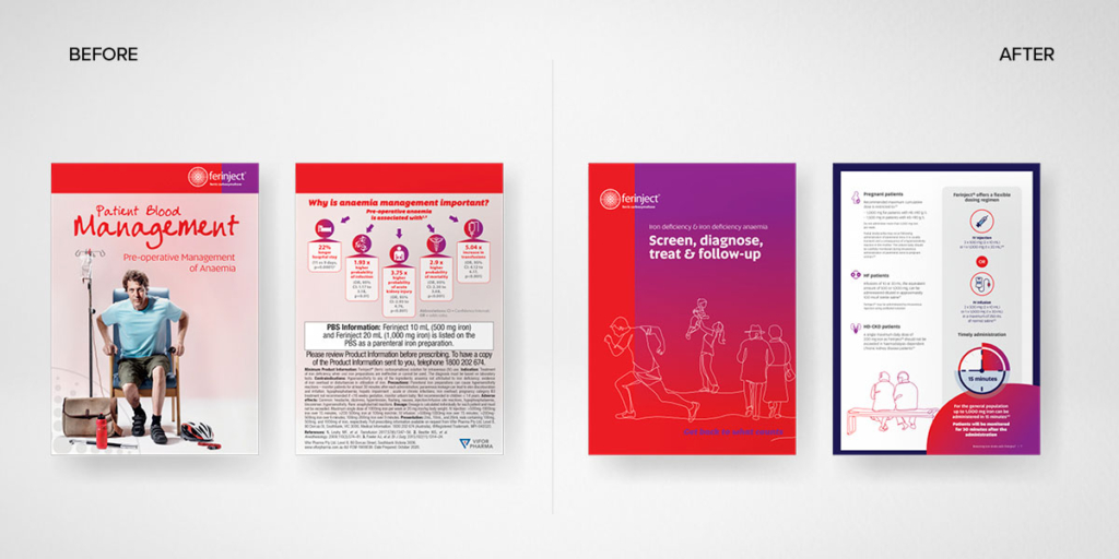
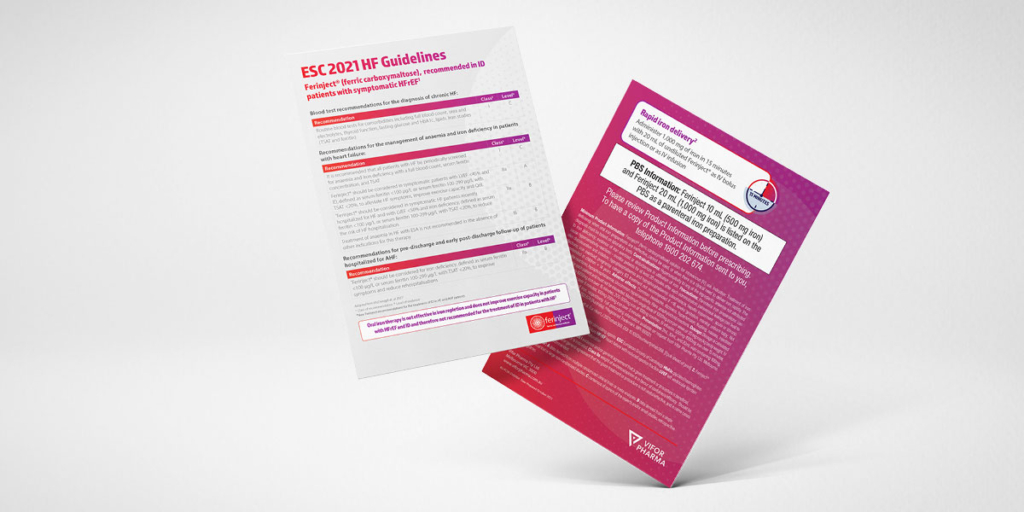
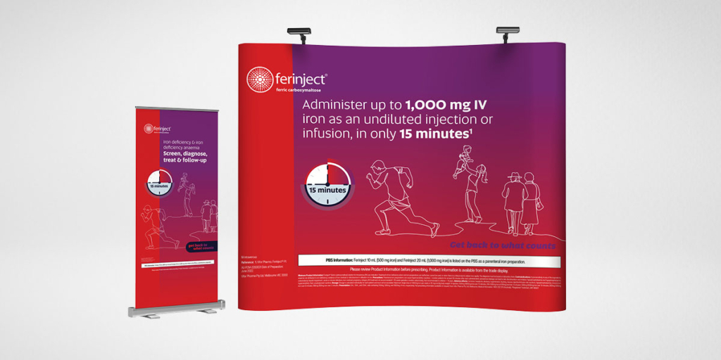
We were engaged to review the look and feel for all the current Ferinject collateral within Australia. The refined design had to work within the constraints of the European brand guidelines.
The process started with the execution of two approaches to the refreshed look and feel. These were presented to Europe and one was approved for execution across all collateral.
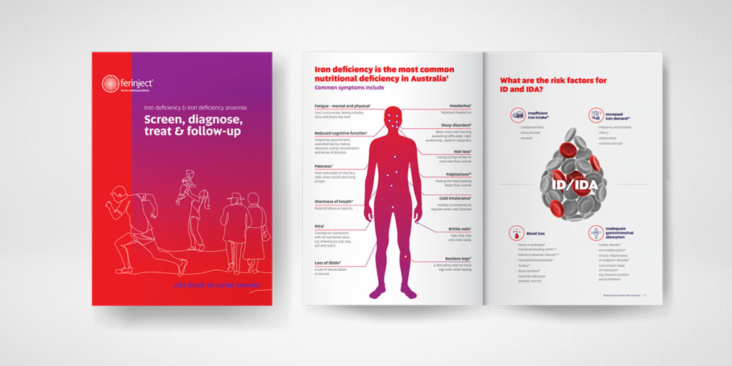
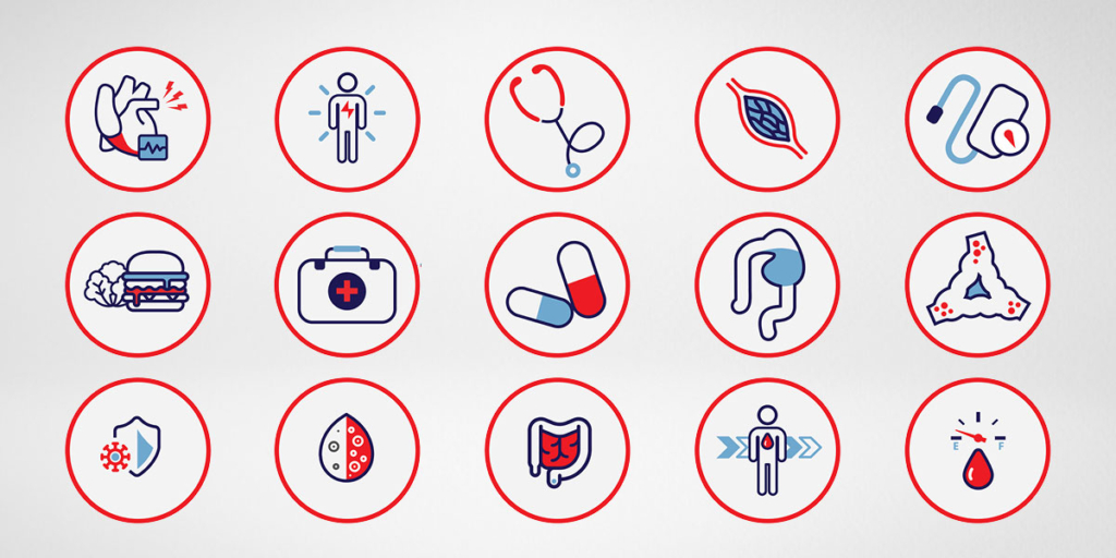
Once approved we started with consolidating all of the individual flyers into a 12 page sales brochure, which formed the basis for icons, illustrations and content.
This was then closely followed by consolidating 5 powerpoint presentations into a 200 page eDetail sales aid. The content was written and referenced in collaboration with the product manager.
Services
Brand Identity
Brand Guidelines
Brochures
Website Packaging
Presentations
Media Releases
